
I was tasked with redesigning a magazine that had an audience of loyal and highly engaged enthusiasts. While the editorial team and I wanted to honor what had made the publication successful, the brand had begun to lose cultural relevance.
Drawing from contemporary race culture and the visual language of aftermarket advertisers, I developed a design system that felt more aligned with the audience at that moment. The goal was to respect the magazine’s legacy while pushing it forward visually.
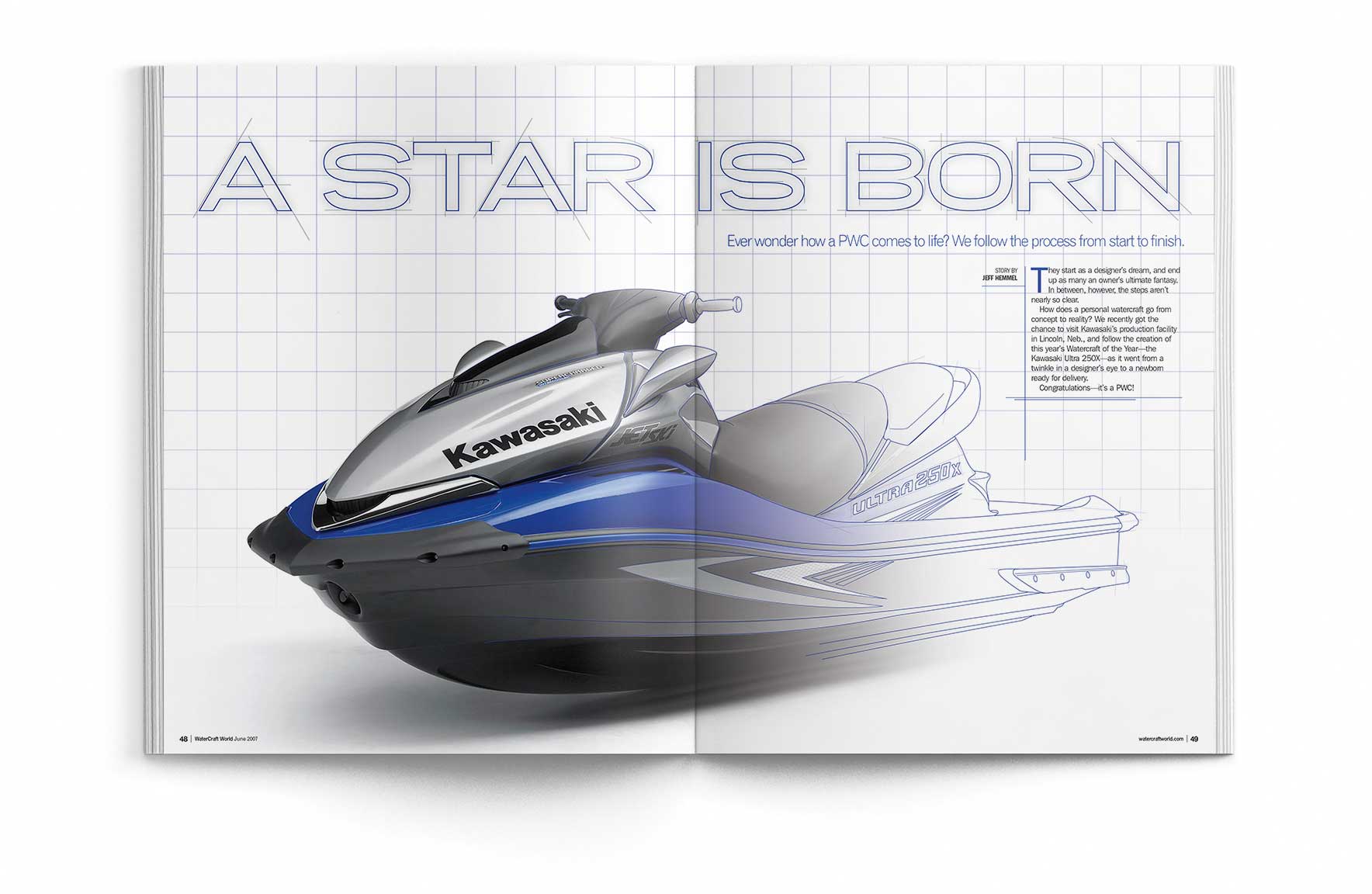
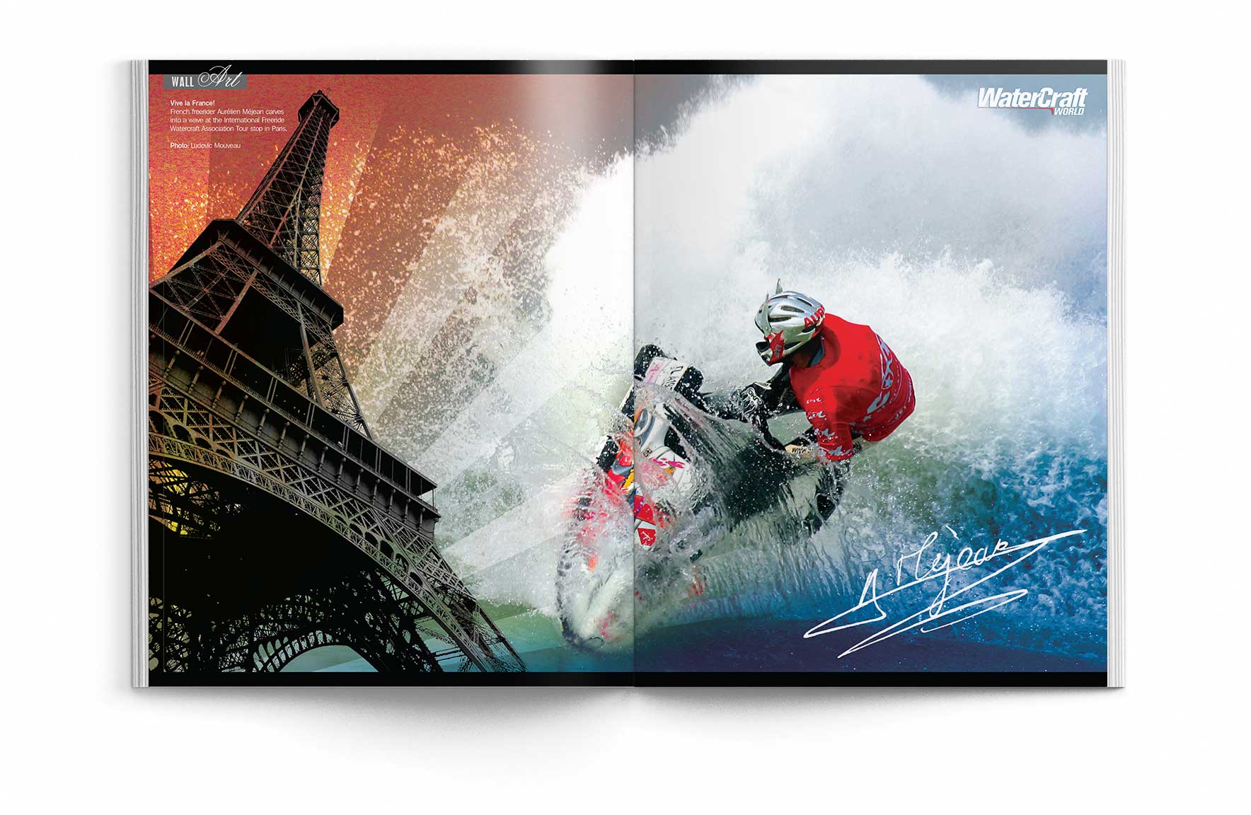
As part of the redesign, I introduced a removable center spread in each saddle-stitched issue—designed as collectible wall art. It quickly became a standout feature, especially with younger readers.
Client: Affinity Media